
CLIENT
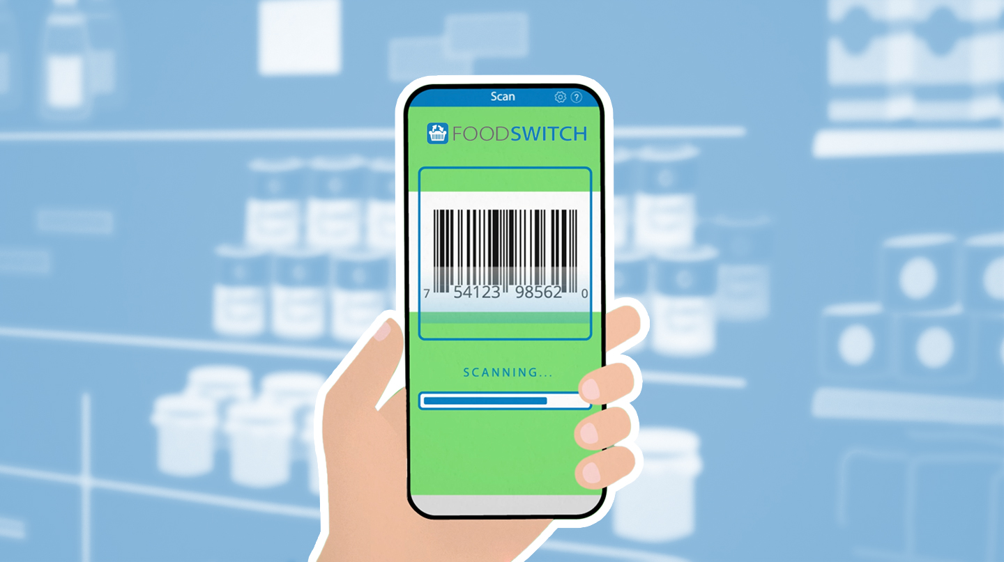
FOODSWITCH
Mobile App.
YEAR
2021
COUNTRY
Kuwait.
The mobile App empowers consumers to make better food choices.
By providing simple health information on scanned products and suggesting healthier alternatives to “switch” to.
APP VERSIONS
Kuwait App Version for Android.
iOS. English versions.
DELIVERABLES
3 Promotional Animated Spots.
Technique: 2D Motion Graphics animation.
Duration: 20 seconds each spot.
Total length: 1 minute.


THE IDEA
Warning colour scheme
Following the Brand aim, Scan barcode and Track nutrition, the proposal consists in a symbolic association of color with a clear message, the same as a traffic light does. In that sense each animation follows a specific visual mood, that is linked to a recommendation level and its consequences, through three different characters and situations.
GREEN (is good) AMBER (be carefull) & RED (not recommended).
After making a consumer decision, it triggers a reaction that affects them directly, in this way the idea is presented in a simple and humorous way to raise awareness of personal consumption habits.
AUDIOVISUAL CAMPAIGN
VO ARABIC VERSION
VO ENGLISH VERSION


ART DIRECTION, CONCEPT & DESIGN
Bea Biela
CHARACTER ANIMATION
Ludwig Camarillo
Nuria Zapata
MOTION GRAPHICS ANIMATION
Nuria Zapata
Ludwig Camarillo
AUDIO DESIGN
Joan Moliner
IN COLLABORATION WITH
George Institute for Global Health
Dasman Diabetes Institute
University of Canberra.